When does a trade magazine become a lifestyle magazine? When it’s Architectural Digest, once a trade mag with ads for posh fencing and even posher toilets between the features. Now it has Hollywood A-listers on the cover (and making welcome-to-our-beautiful-home videos for AD’s Instagram) and inside the cover are double page spreads for brands such as Louis Vuitton and Rolex. There are still ads for posh toilets but they are now towards the back.
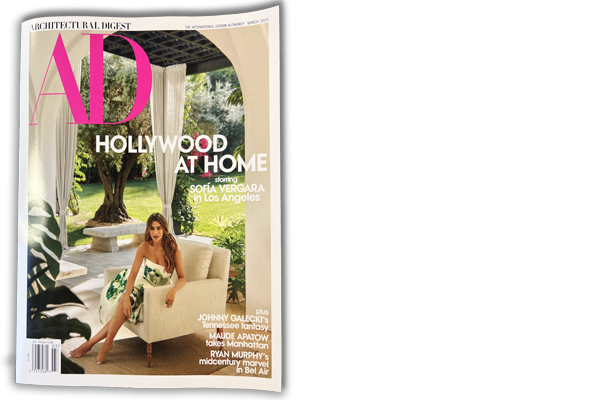
Interspersed with the handbags, watches, jewellery, the first class travel and holiday resorts are the ads for the statement garden furniture, the hidden kitchen applicances, the two-storey high electric blinds and the sofas, oh so many sofas. Both are selling a luxury lifestyle but they have distinctly different ways of going about it.
Ridiculously expensive handbags went through a phase of not bothering with the product at all. Just the logo sufficed. Now they’re back, in a surreal industrial settings, hanging from the wrists of models in slightly contorted poses that shows the bags at the best angle. No words, no logo, just the name of the brand. It is a consumer ad.
The next spread is mostly taken up with a father and his toddler daughter enjoying a cute moment on the sofa, as the sun shines in through the slatted blinds hanging at the floor to ceiling double aspect windows. We know the ad is not for the cashmere cardigan or the vast cream sofa. It’s for the blinds. Because under the strapline Live Beautifully, the text tells us about the electric blinds. How they can be ‘scheduled to automatically adjust to their optimal position throughout the day’ plus a little bit more detail. And there is a subtle caption in the corner with the make and model.
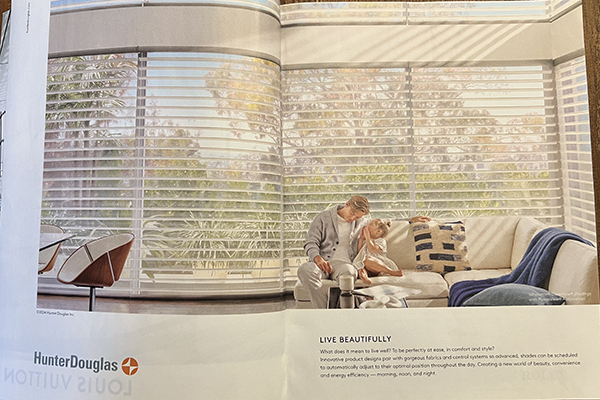
Both ads are designed to appeal to the person using the product, but the blind ad has to appeal to the interior designer as well. It has to appeal to the company that is going to do the work for the guy on the sofa. It is a trade ad.
Printers, given that their products are made to be looked at, don’t much care what their machinery looks like. What they really care about is if it will solve their problems, make a profit and keep their customers happy.
Take the Koenig & Bauer ad in this issue. The message is ‘The fastest job changeovers for more jobs per shift’. Yes, there’s a pic of the press but it’s the words that tick the boxes, not what the machine looks like. A few years back its ads simply said ‘We’re on it’ with a cup of coffee on a counter to emphasise the automation. It’s still excellent for brand recognition, but it is a slogan, not a message.
Print Business is slow read magazine and it tends to stay on the boss’s desk. There’s a window of opportunity as they come to the end of a feature on the lefthand page to see your ad on the right, just before they turn the page. Don’t waste that opportunity to make an impression. If they only see one thing, make sure it is your message first and foremost.