Litho printing has always been able to push beyond the standard four-colour gamut. Replacing the magenta plate with a rhodamine red or cyan with reflex blue can deliver higher impact print, if not exactly with the true to life colours that CMYK delivers.
Additional print units can add Pantone spot colours, metallics, greens, blues and oranges. Carton and flexo printers handling packaging are increasingly adopting seven-colour printing, CMYK plus orange green and violet to eliminate the need for wash ups between printing needed with Pantone matched inks.
The interest in these techniques is rising because of a combination between proliferation of skus, shorter print runs and frequent promotions. The shorter the print run, the more of an issue waste becomes, both in material and unused special inks. Modern presses have the tools to manage the consistency required when eliminating special colours and thus that waste.
This is ECG or extended colour gamut printing. But there is no need to go to a seven-colour press to deliver an unexpected boost to the impact of print. Printers seem to have lost the art of mixing inks whether in the can or on press to produce a high impact magazine or catalogue cover using fluorescent colours for example, or running two blacks for a deeper colour, or simply an extra colour to expand the gamut a litho press can reach. Customers have become used to submitting a colour managed four colour PDF and printers accept this without question.
Despite this, the ability to be creative with ink remains in the armoury of the litho printer, even if rarely used. Digital printers, and especially inkjet printers, have been confined to CMYK. There are exceptions: HP Indigo has models that can print seven colours, though rarely used because of the impact on productivity, the Landa presses have the option of seven-colour printing, but not of spot colours. Among the toner press providers Ricoh has offered a fifth colour for a while and the Xerox Iridesse and the Fujifilm Revoria PC1120 it is based upon, has six colour slots for different toners. Konica Minolta has added the option to print white and only Canon has stuck to four colours only. Even Oki can supply printers with white and clear toners.
In the main the extra colour stations have been used for white, clear toner and sometimes metallics, delivering higher value enhanced print and going a bit beyond what a four-colour press can achieve.
White, for example, can be used on darker materials either for a contrast or as a base layer for four colour printing on top of the white. This works too for clear substrates. A silver can be used as a base for four-colour print though the non transparent nature of toner lessens the effect compared to litho inks which are transparent. A clear toner can be used as a spot varnish, depending on the machine, resulting in different reflectance values to help an image or pattern stand out. But four-colour printing remained precisely that.
Ricoh has also been able to offer neon yellow and pink, but as highlight only colours, not part of the CMYK palette. That is matter for software so is not a hard restriction. Ricoh UK national sales manager Tim Carter says that in addition the company offers an invisible toner that fluoresces under infra red light as a security or perhaps a promotion feature.
It was an involved process to switch from one colour to another on the first machines with the fifth colour acting as a barrier to uptake. That has now been reduced to around 20 minutes he says. “We have a lot of customers using the white to produce window graphics which is possible because the white we have is very opaque so only needs one hit,” he says. “Others use the neons for ticketing applications or extending the colour gamut. And printers can achieve a decent extra margin with these.”
Large format inkjet presses frequently include intermediate variants on the cyan, magenta and black channels to improve the smoothness of colour gradations while in some cases the additional colour can be a fluorescent or neon colour used as a highlight colour for posters, invitations and the like. This is all changing as suppliers seek to offer customers something extra in what is an over supplied crowded market. With little difference in performance when printing CMYK, being able to deliver gamut expanding colours could help printers to a higher margin for their work when a fluorescent colour can be used as part of a four colour image.
Fujifilm and Xerox have offered this on the Revoria PC1120 and Iridesse respectively using a gamut boosting pink. This also enhances printing of flesh tones on faces helping them to appear far more natural and with smoother gradations than with CMYK toner alone. When used carefully this can result in a much brighter cleaner image than a four-colour-only digital image.
The other advantage is that it enables print to start to take a stride closer to what designers can see on their RGB screen. Now Fujifilm has taken a second stride to be able to print a close match to the screen colours. This is because with the launch of the Revoria PC2120, Fujifilm has added a neon green to the optional extra colours which with the pink boosts the colour gamut in almost all directions. Like ECG litho printing, the extra colours enable the press to achieve 93% of PMS colours says Fujifilm giving designers more scope when specifying digital printing than previously.
This will be enough of an advantage to some printers that the investment in the machine is justified on this ability alone.
In digital printing Pantone colours have been restricted to HP Indigo machines where it is possible to specify special mixes and to use these on machines that can take up to seven colours. The drawback to this is, like the use of special mixes of litho inks, that printers can quickly build up a library of partly used and may-never-be-used-again inks. And each additional colour requires a further rotation of the imaging drum, slowing productivity.
Fujifilm’s move is potentially transformative in other ways. The four-colour model has been in place since the start of the 20th century and always represented a compromise: the minimum number of colours able to deliver convincing colour while making it possible to print in register and later to make film separations.
Improvements in press technology, computing power to handle the data and run the calculations for separations and in producing colourants mean that CMYK+ printing is possible and also practicable.
It may be coming at the right time. LinkedIn and other online forums are frequently host to discussions about why the colours that looked bright on screen turn out to be flat when printed on paper. It is supposed that designers trained on screens want their work reproduced in magazines and brochures to look like the image in front of them. When it doesn’t they can turn away from print itself.
The advent of ready to go AI infused online design applications like Canva and Figma will only make such disappointment more frequent. These tools are unlikely to include support for print, whether CMYK or what Fujifilm already describes as “5uperColor”. (This may need adjustment once the additional green arrives).
However, the possibilities opened by use of neon pink have hardly transformed awareness of what is possible. Designers simply do not know what is possible and until they do, gamut extending digital print, like foils and spot varnish, will not take off. One Xerox Iridesse printer says that the neon pink option on its Iridesse has only been used on one job since acquiring the press, despite a campaign to promote its potential.
“We have had one client job in three years,” he says. “We use the white and clear and they look great. But for additional colours there’s a missing communication and education piece. We need to make it easier to use these colours. Brands and designers need to know it’s available and to understand how to use it.
“We probably don’t visit the designers or talk to the right people about these features, but currently there is no demand out there.”
This is recognised at least in part. Xerox has devised a programme called Genesis to promote the use of additional colours, educating designers to what is possible, and Fujifilm has together with Taktiful developed a training and awareness course in the US called Aspire. A similar series of seminars is being put together by Nutshell Creative in the UK to accompany the roll out of the new Revoria PC2120. This goes beyond Fujifilm’s Make More support programme which is about helping printers to respond to market changes and customer requirements for faster turnaround and shorter runs as much as about harnessing the potential of six-colour printing and other added value embellishments. This is where Aspire steps in. “It is a set of resources to help customers make more, but is only available to the customers that have made the investment in the Revoria,” says Fujifilm UK general manager Andy Kent.
One part is about training designers how to design with the additional colours and show them via an interactive proofing tool what the difference can be, the other half is showing printers and business owners how to market and sell the additional capabilities. Research by Keypoint Intelligence, referred to by Xerox, says that printers can expect an 89% premium when using these effects. This is research from the US. The European and UK figures may be different, but probably not by much.
“With the new Revoria we can print colours that were never possible before in a toner press. Previously we could match 70% of Pantones; now we can reach 93% because this provides greater colour accuracy,” says Fujifilm’s documentation.
DPS is one of the dealers that will sell the new Revoria in the UK. Managing director Will Doherty was at the launch of the machine and was impressed. “We had a lot of inquiries about the Revoria 2100S. Everyone is now talking about the 2120. It will help the transition away from litho to digital for commercial printers. The 1120 has been close, but it was not quite there. The 2120 is absolutely there,” he says. “On the previous machine trying to colour match to litho or on a long run, say 10,000 sheets, was virtually impossible.”
Ricoh has also accumulated a library of content around marketing the capabilities of expanding the colour gamut, the use of metallic toners and so on. “Within that approach, there’s content about what questions a sales executive should ask to open the opportunity,” says Carter. “It’s an area where we believe there will be growth in the future because it creates additional value for a printed product. And we need to continue to help customers to take the right approach in selling and to be brave enough to ask for a premium.”
The additional colour is only possible on the Pro C7500, its mid range production printer. The Pro C9500 will remain the four-colour-only workhorse for volume printing. This is not to say that it is a look alike four-colour press. An optional thick material kit is used to feed 800 micron board and is used to replace plastic cards with a recyclable alternative for membership, loyalty and similar cards extending the footprint the press is capable of addressing to the parts of the creativity spectrum.
Part of the ecosystem around the development is a simple to use an online viewer that shows the difference between the RGB and CMYK and CMYKPG image, which shows the impact of varnish and foils. The industry standard is Visualis3R from Khaos Technology. It is now adopted by pretty much every provider of presses able to print additional colours and providers of the technology for spot varnish and foils. Ricoh is the most recent company to sign up.

While the designer may have to specify the embellishment in a separate layer, what that layer represents can be seen accurately on screen rather than as a solid colour overlay which requires interpretation by the user. Instead Khaos shows a representation of the job with all the reflectance of foil and varnish and the impact of printing on foiled papers and with additional colours. In terms of selling the impact of digital embellishment, this is as vital as a screwdriver is to a carpenter.
It began as a way to show the impact of ColourLogic software when printing litho on metallised papers and that continues. But as digital embellishment and additional colours have arrived, the software has been enhanced. This includes EVE, the embellishment value estimator to allow a printer to create pricing that reflects the value of embellished print rather than applying a cost plus model.
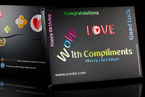
In terms of the embellishment press, Scodix was the first and is still the standard bearer for what is possible with digital embellishment. This goes beyond spot varnish and application of foil. The range of surfaces that can be subject to Scodix treatment is evolving constantly; the effects that are possible are also increasing creating new effects.
The technology has been successful with carton printers, because Scodix can work with a B1 sheet as well as having models for B2 printing with an extensive portfolio of book printers. Photobook specialist Shutterfly has recently ordered another four machines, this time the Ultra 2500SHD press with sharper detail, sharper edges and smoother gradients than earlier versions. Online printers are also on board. Small commercial printers are not.
Nor are they users of the equivalent MGI presses.
The French company produces the JetVarnish 3D as well as versions for roll to roll label enhancement. It is effectively owned by Konica Minolta resulting in the AccurioShine 3600 iFoil. This is pitched at users that have already requirement for embellishment perhaps using conventional varnishing or hot foiling technology. The digital unit will handle the shorter runs or runs where versatility is such that creating dies becomes too restrictive.
The Konica Minolta machine is up against the Duplo Dusense with both SRA3 and B2 machines. To date there are only a few of the newer B2 model, at Imaging Centre and Flexpress, with more users for the earlier machine. When first launched the company hoped that this could become the new multi finisher in terms of popularity. That hasn’t happened in this country, but in Italy, France and other places digital embellishment has taken off.
It is, Duplo International CEO Bruno Piquet has said, “about emotion”. It is also about helping the brands that are the ultimate customers stand out with their products and conveying an impression of luxury. This is evident in the popularity of foil on labels, on presentation boxes and the cosmetics and luxury goods that drives demand in parts of Europe.
The company put digital embellishment front and centre at the last Drupa with plenty of samples to show how foil, varnish and tactile effects can lift the printed sheet.
Now Duplo is introducing a machine at a more cost efficient part of the market thanks to its partnership with Bagel Systems. Bagel was acquired by Canadian company Skandacor last year and that company has now produced a low cost embellishment machine. US list price is around $70,000, but this will not be anything but a guide price for any UK launch as service, training installation and other costs will be different in this country.
The FinishPro 3D 1623 is described as a resin printer, that is it prints the clear polymer to create a matte or gloss varnish with inkjet heads that is accurate to 0.2mm and can be to 500 microns thick.
It is up against the Vivid Razar, also a digital varnish machine developed in the UK and built on the success of Vivid’s flatbed cutting tables. It uses Xaar inkjet heads to fire a clear polymer for the full suite of varnish effects, from flood to tactile varnish effects. It also retains its cutting table tools so that when not used for embellishment, Razar can be used for digital die cutting.
The Razar was shown in prototype form at the Print Show last year and shipments and installations have now begun. It is not a fast machine, but equally it is a low risk investment given the capital cost and the fallback use as a cutting table. That Vivid argues will give companies the confidence to invest to develop a new service. If it takes off this is an easy step to a Dusense or AccurioShine and then to a larger MGI or Scodix machine.
Digital embellishment becomes an everyday application.