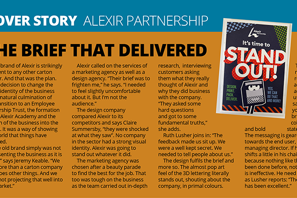
The decision to change the visual identity of Alexir was a natural culmination of the transition to an Employee Ownership Trust, the formation of the Alexir Academy and the growth of the business into the future. It was a way of showing the world that things have changed.
“The old brand simply was not representing the business as it is today,” says Jeremy Keable. “We are more than a carton company that does other things. And we were not projecting that well into the market.”
Alexir called on the services of a marketing agency as well as a design agency. “Their brief was to frighten me,” he says. “I needed to feel slightly uncomfortable about it. But I’m not the audience.”
The design company compared Alexir to its competitors and, says Claire Summersby, “they were shocked at what they saw”. No company in the sector had a strong visual identity. Alexir was going to stand out whatever it did.
The marketing agency was chosen after a beauty parade to find the best for the job. That too was tough on the business as the team carried out in-depth research, interviewing customers asking them what they really thought of Alexir and why they did business with the company. “They asked some hard questions and got to some fundamental truths,” she adds.
Ruth Lusher joins in: “The feedback made us sit up. We were a well kept secret. We needed to tell people about us.”
The design fulfils the brief and more so. The almost pop art feel of the 3D lettering literally stands out, shouting about the company, in primal colours. The Alexir name is repeated across all activities using the same in your face bright colours and bold statements. The messaging is geared towards the end user, not the managing director. If he still shifts a little in his chair it is because nothing like this has been done before, not because it is ineffective. He need not worry as Lusher reports: “The feedback has been excellent.”